D2C Oral Beauty
which craft?
Naming that evokes a sense of hope, energy and aspiration.
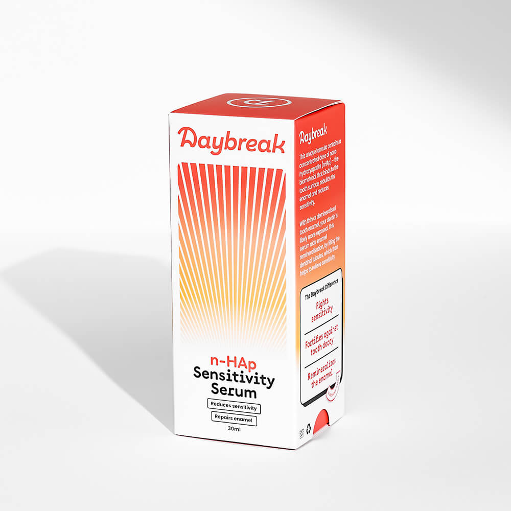
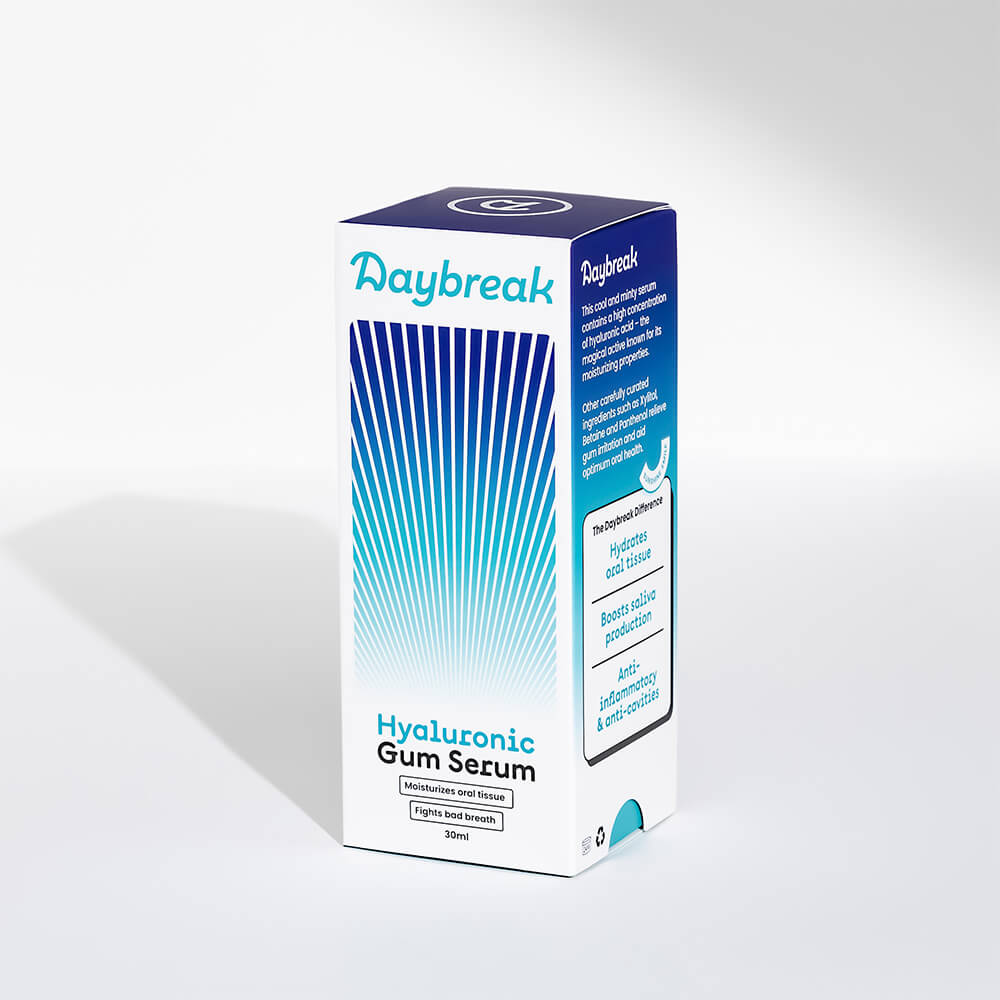
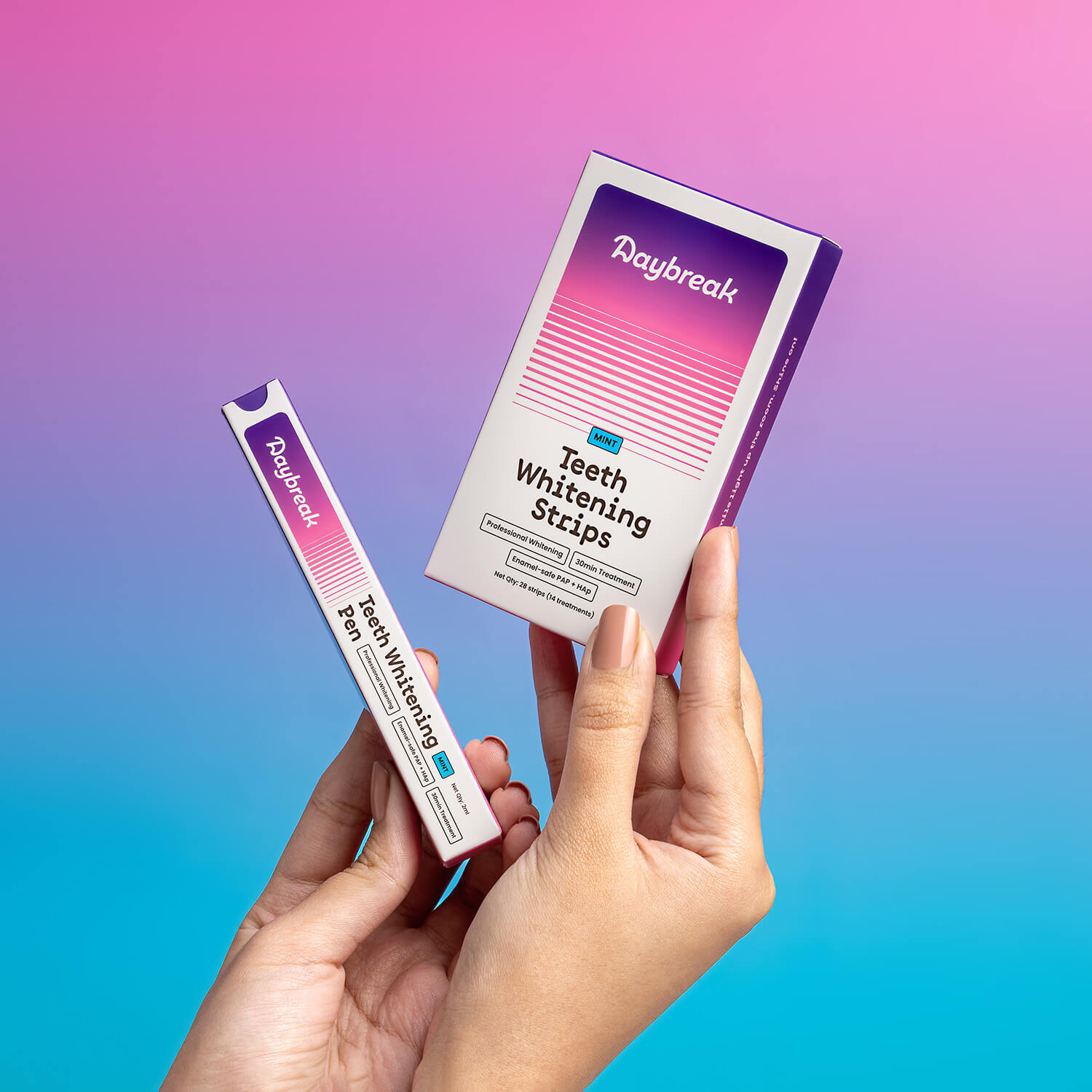
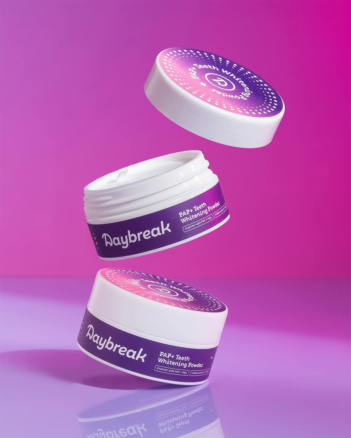
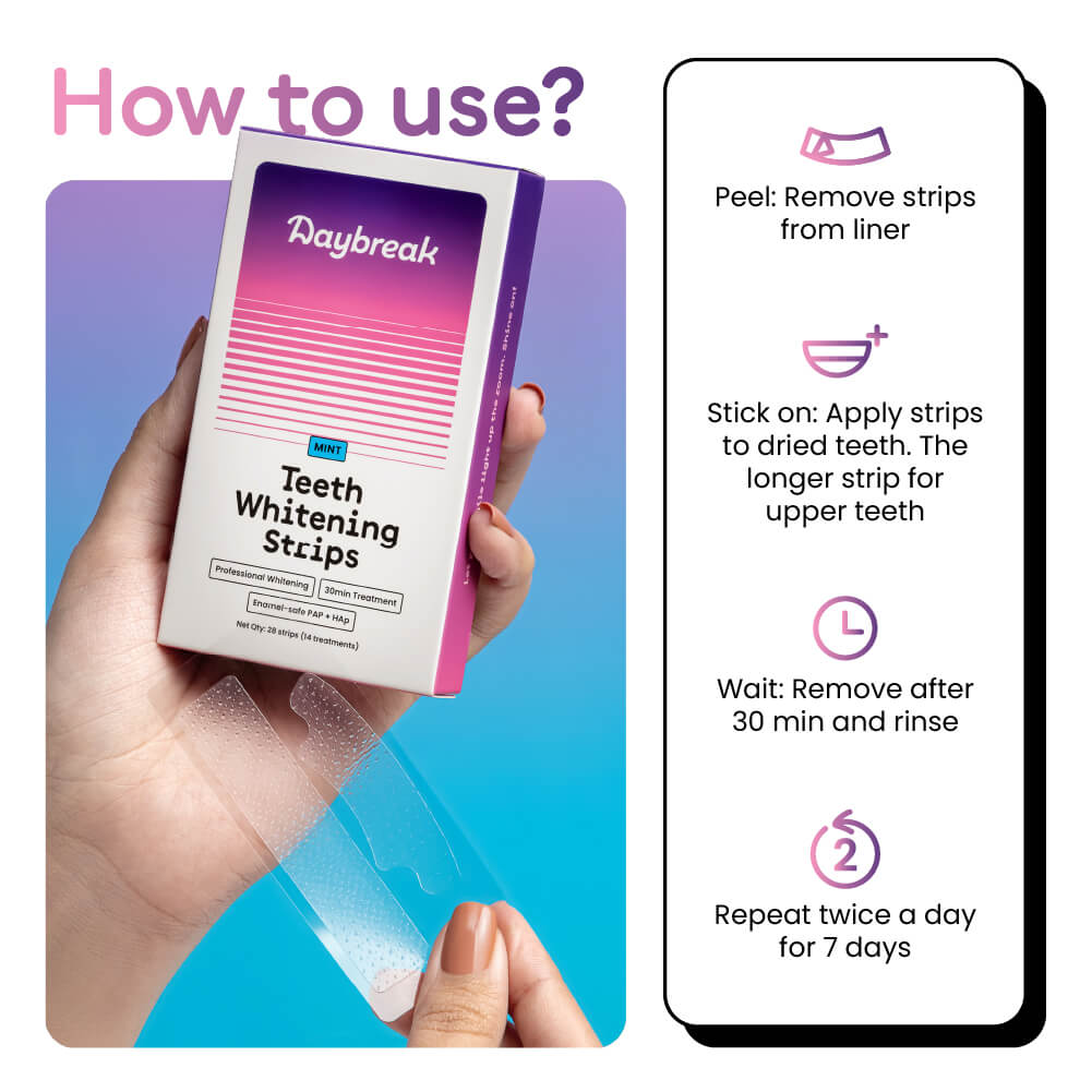
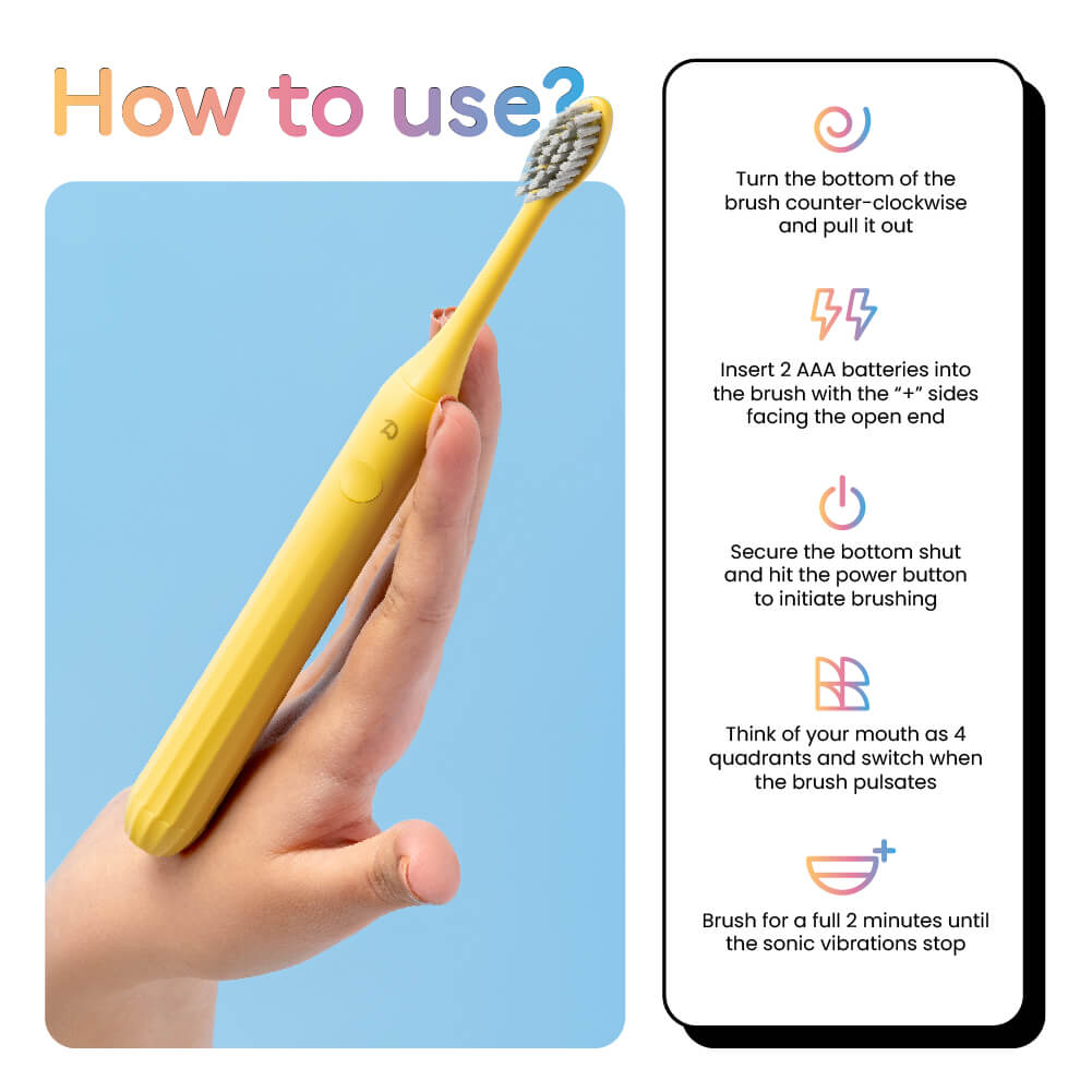
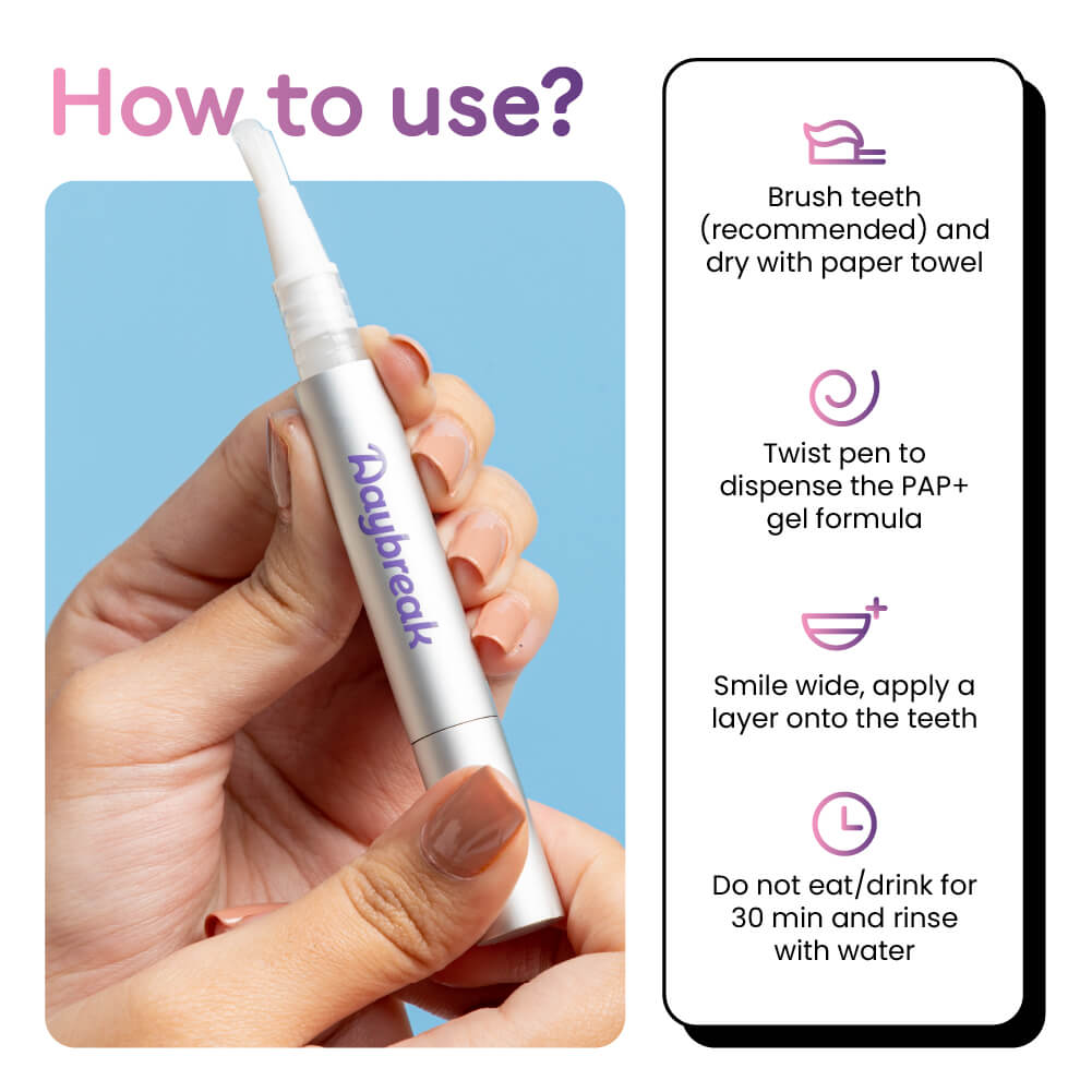
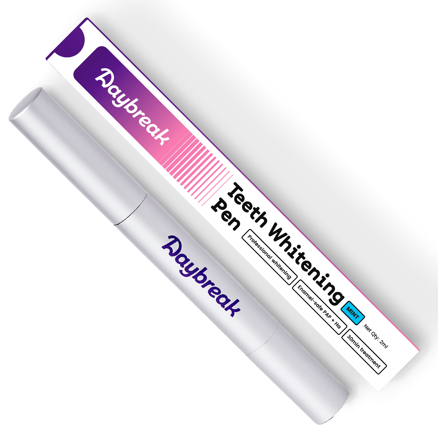
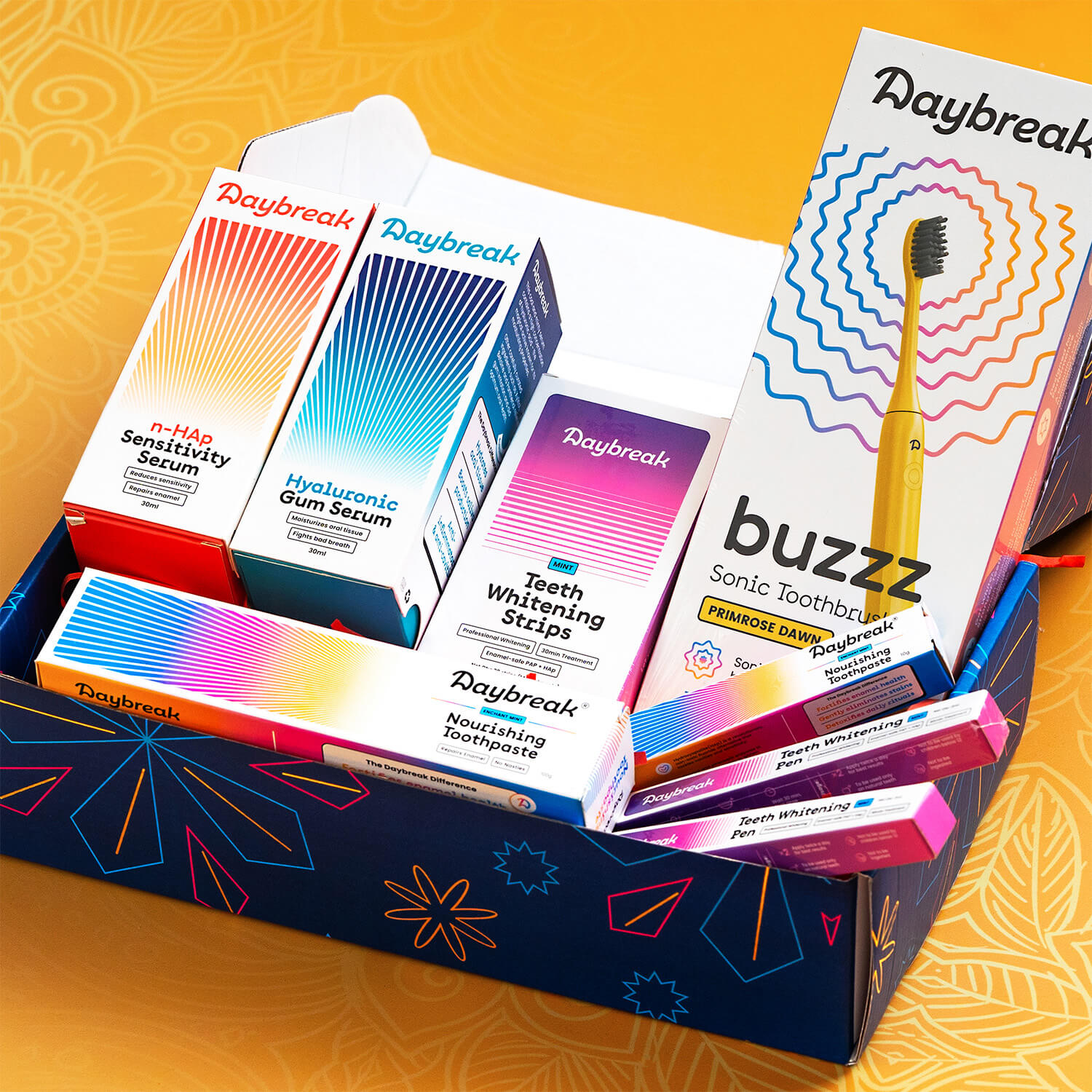
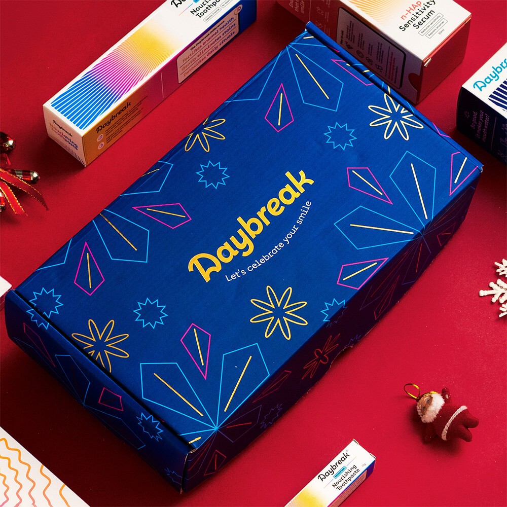
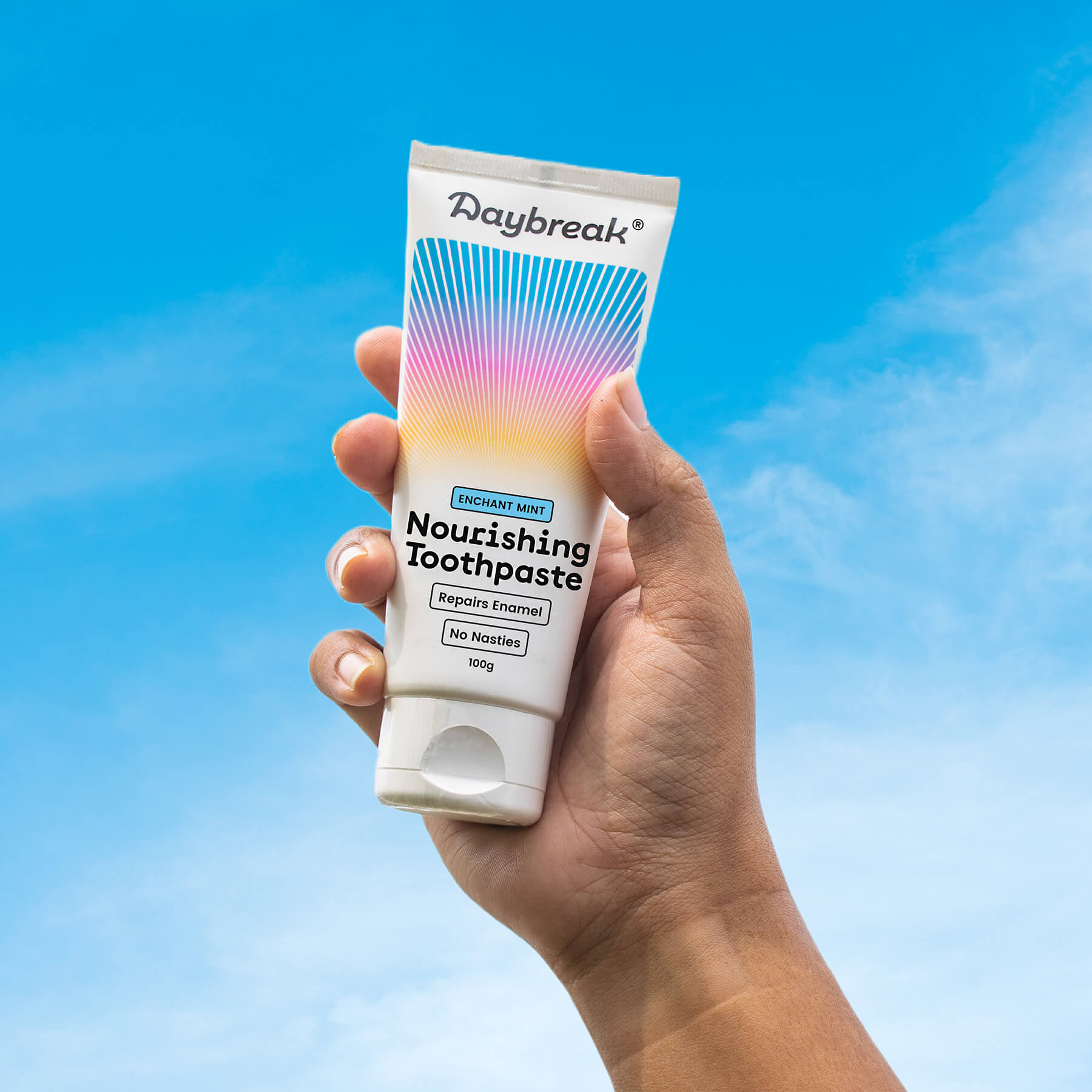
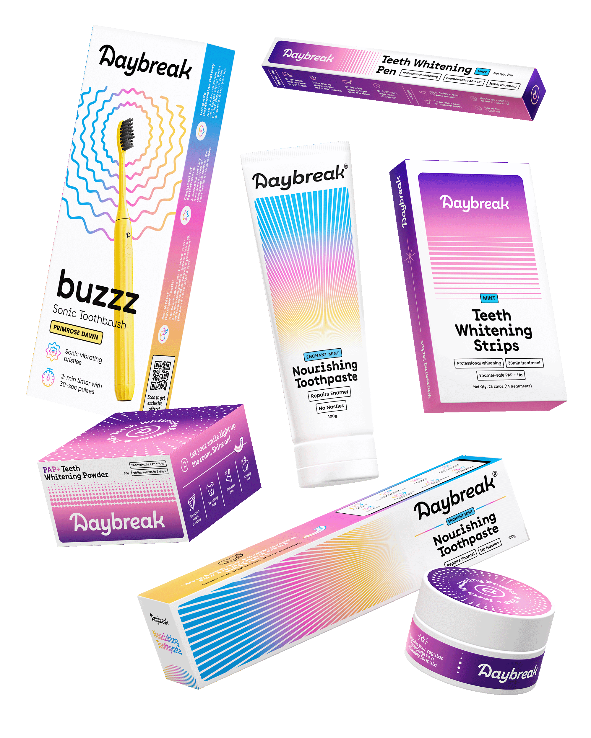
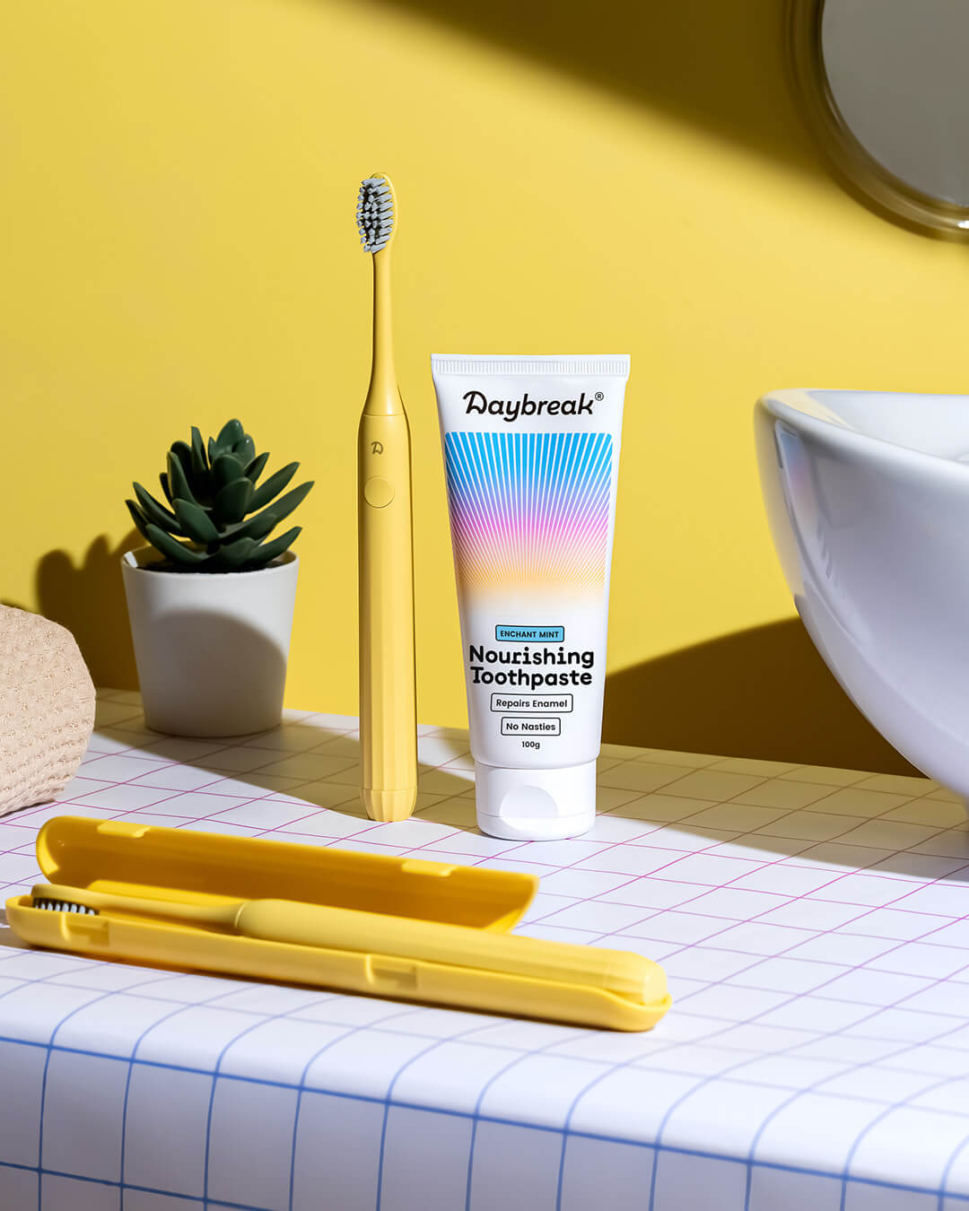
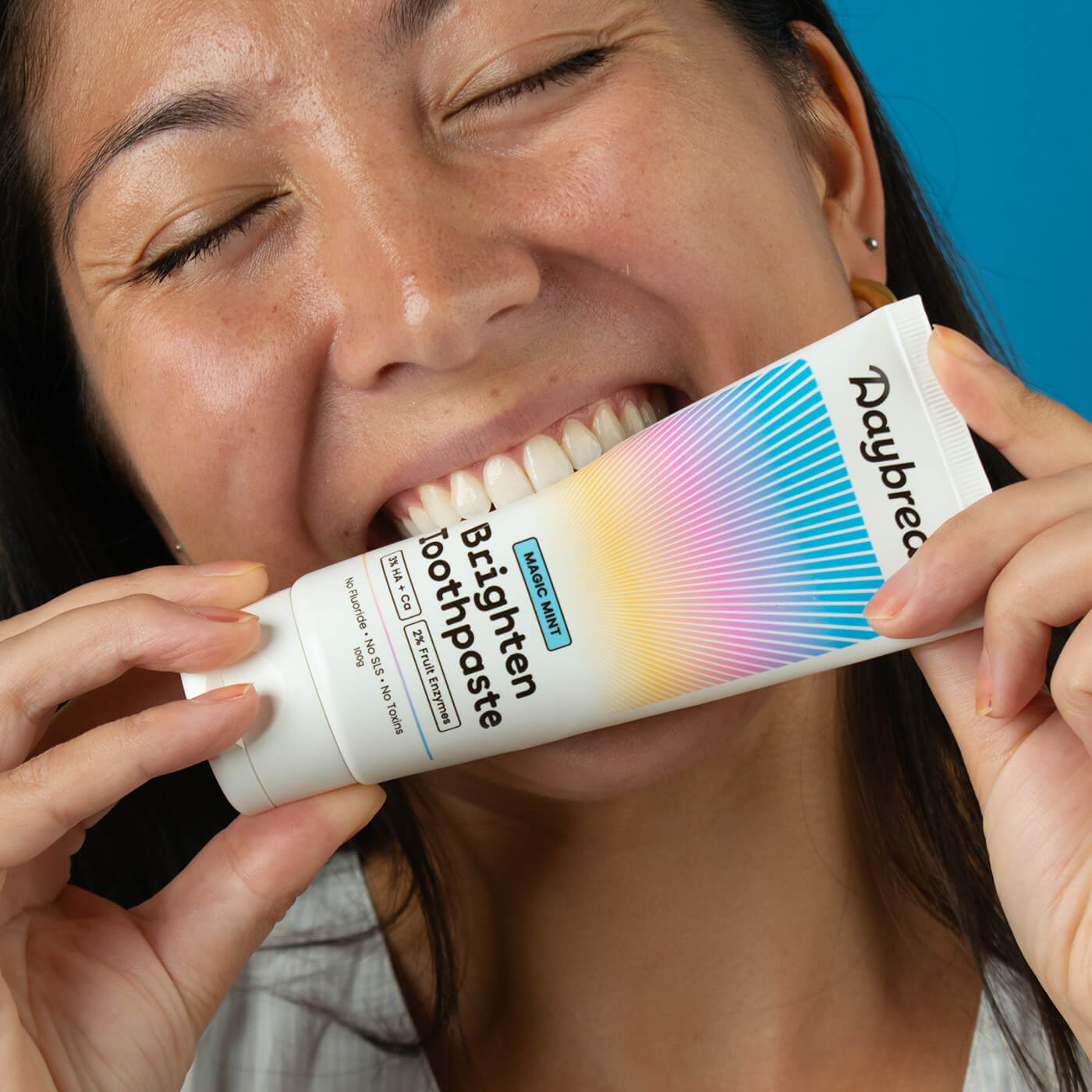
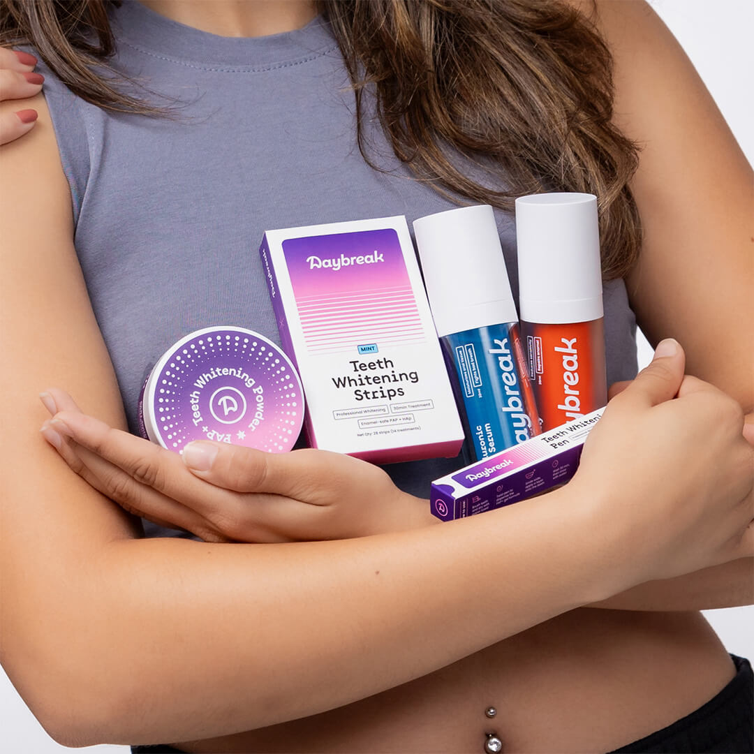
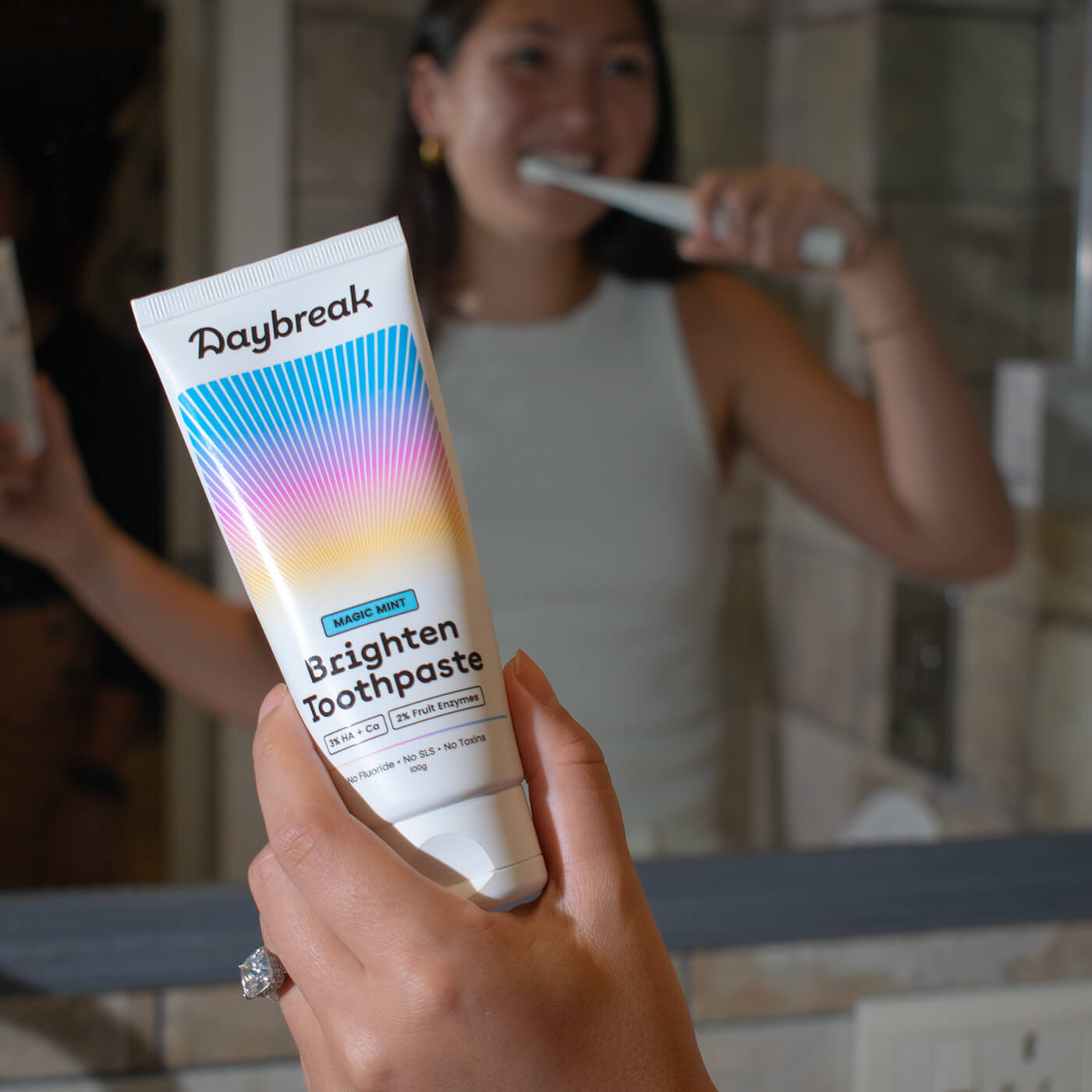
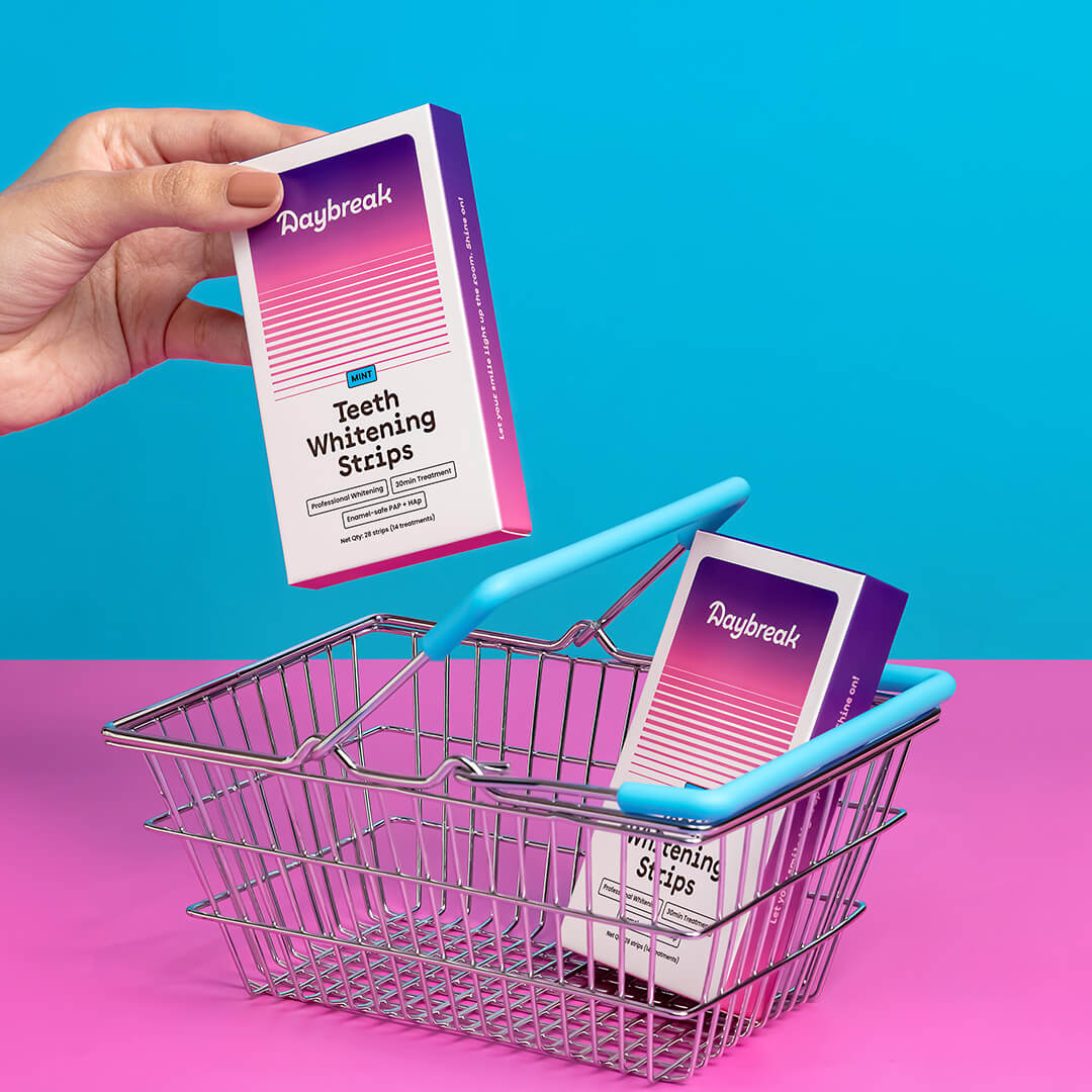
Packaging Design that evolves Oral care into Oral Beauty, using the movement of the sun and colours of the sky as a visual story.
Brand Identity Design that uses a custom typemark, memorable colours and clean typography to be energetic, yet classy.
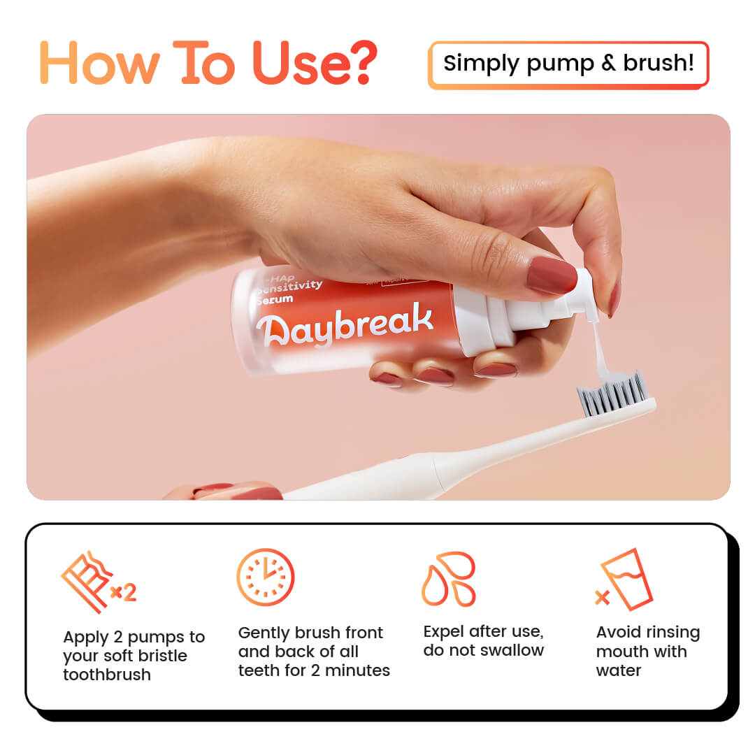
E-commerce Design that makes sure that even at the POS, the brand is consistent yet effective.
Energy of the sun and colours of the sky.
Not your almost dystopian, over-optimistic kind of new day. But an unexpected beautiful sky in the middle of a busy day.
(Adults... I tell you. Everybody is busy)


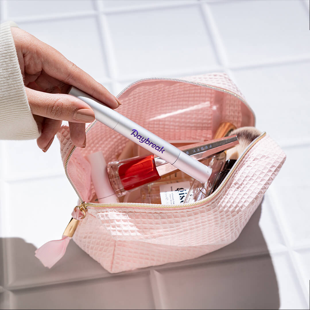
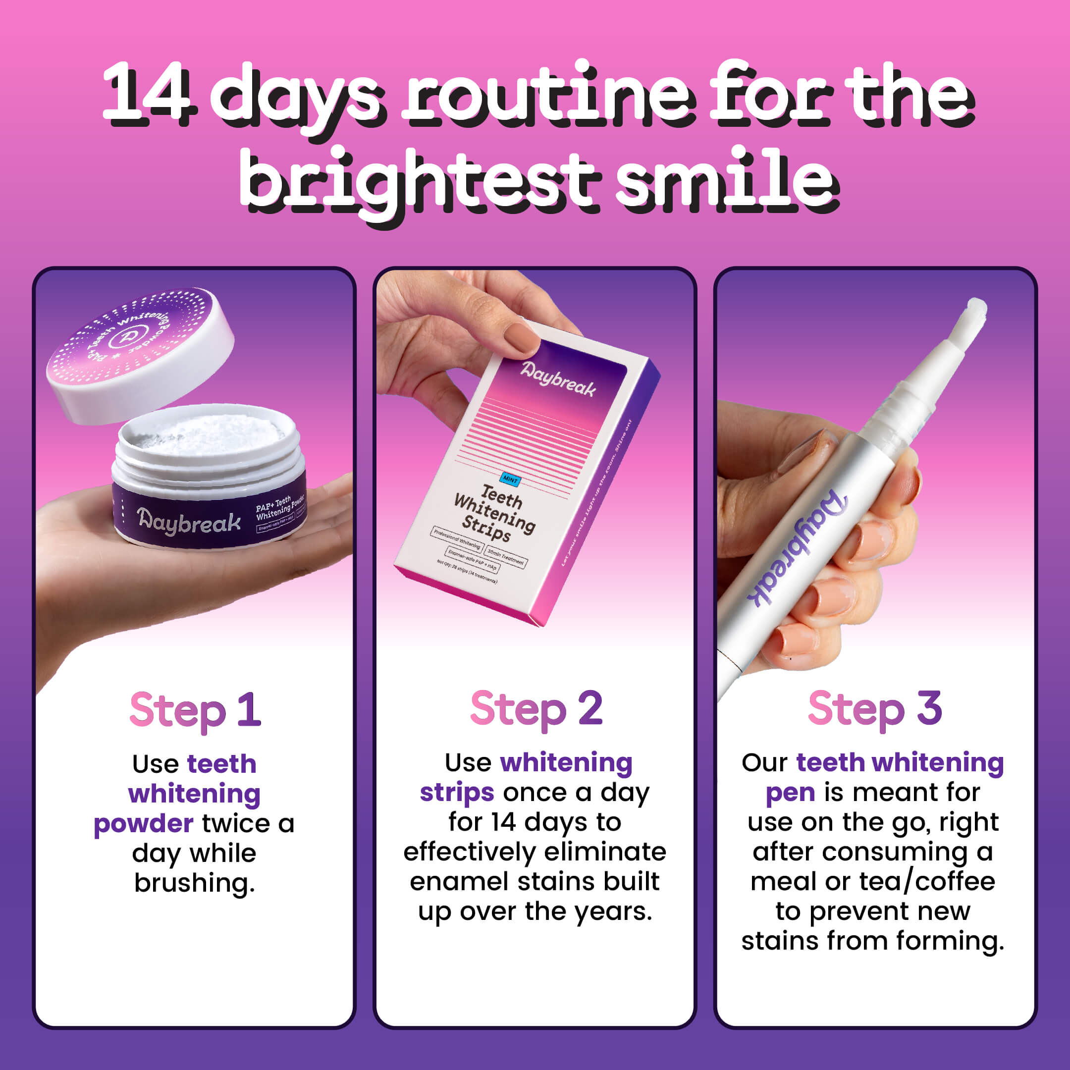
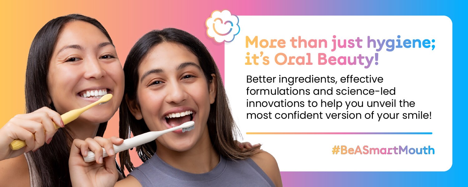
The traditional oral care category is functional. It's a chore!
We created a brand experience that treats oral care like self care. Designed to sit well amongst your repertoire of skincare and makeup.
Let's put a smile on those faces (: